29.01.09 Production log

January 29, 2009

Today i looked into the planning of my image, deciding the location the model and taking into consideration time management, like for example how long it will take to take the images, how long it will take to process and edit the images. Then after applying them to the style and what i plan to have for my front cover. Time management is something that i shall later mention but for the minute there are only a few things i need to plan for. Time management is important because it gives you a good idea of how long you have to get everything done. I have a presentation and a focus group with feed back from my peers to plan for. This will be good because then i will have some feedback to refer to on my initial ideas, i might even gain something more from it like new ideas and better versions of my ideas. I have most of this already planned, i just need a little more on my ideas to mention, but as i mentioned hopefully i will gain a lot from my peers. Today i also created a few sketches of my front cover and the main image i aim planning to take, the photograph is of a male standing with a guitar, this will be also used fro the DB spread but it will be more of a low angle and the sky will be used for the background so the writing will be seen clearly. I also made some sketches of basic font designs, trying out the bold, thin and dramatic styles to see what fits the main title i am planning to use. the Title i plan to use is ‘Thrive’ its got a good ring to it and can be recognized throughout the music and myspace scene.


*Attach some pictures of the sketches.*


Image Planning

January 29, 2009

29.01.09-

My image plan and what i plan to finally do will probably change. At the minute this is just for reference and some basic ideas. My double page spread will try to be placed around this design:

For the double page spread i wish to have a picture of my model on landscape layout so i can resize it to fit accross 2 sides of A4. The picture its self will be of a male holding a guitar behind his head with sky behind him, i want to do this so that i have a clear background to write my text over. The subject will be more to the left hand side so i can then split it into 2 A4’s.

Actors/Model

For the photographs I shall use some of my friends, the front cover and double page spread will be the same model. The contents page will be different, a more informal shot of some one playing the instrument. I have yet to arrange my model, but i have a few friends that have volunteered for the task. Its just a matter of finding who i think best fits the character.

Locations

For these shots the location is still not decided, the front cover and double page spread image only needs a very minimum background as there will be writing on that page. The sky is the sort of background i was hoping for, something very open and free.

Costumes & Props

The costume will be very simple, nothing to flashy or anything that stands out to much. Simple colors like black and grey, it will probably be a big coat, black and jeans. The whole idea about making it simple is that i don’t want this artist to appear to big and important, i figured if he looks a lot like what the readers might look like then there’s a common ground, something they can relate to.


Why Disney Need Pixar.

January 27, 2009

“If you can’t beat em’ buy em.”

Disney need pixar mainly due the fact that they are such a big threat. If pixar aren’t owen by disney they become big competition, not exactly enough to put disney out of business, but enough to effect their business. Disney need Pixar because of the amount of money that Pixar makes them. Pixar have the latest technology and some of the best animation and stories out there. Disney’s last hit was in 1999, with Tarzan. Since then there technology is dated and ideas lacking in comparison to major rivals Pixar and Dream works. The very key and main reason that Disney need pixar is that since ‘Toy Story’ Pixar have had hit after hit. Pixar are the kings of the animation world and disney need to bring back their name into the animation world, this is the reason they wanted to and ended up buying Pixar.


Production Log 22.01.09

January 22, 2009

Today i researched into my target audience and took a look at some of the certain grades and brackets magazines like mine fall into. I researched into kerrang magazine to see their age range and grade, the ratio of male to female and how they attract these target audiences.

picture-4

I realised that there is going to be a few problems in the way of attracting my audience that i will have to encounter and find ways to get around. For example gaining the reputation that magazines like kerrang have. I also created my original ideas which i will present to my peers and gain feed back from to tell which will be best and which will be easiest. Price is something i shall have to consider because of grades and certain brackets my magazine may fall into, this is also something which i shall highlight in my focus group and with my peers.


Initial Ideas

January 22, 2009

1. My first idea is a magazine aimed at 14-25 year old, it s a rock/pop/metal magazine. the main feature or something it will feature is a specials section where it has profiles of artists out side of that genre, rap, hip hop dance everything. Even some styles that are a lot different from what we usually here. it may feature a dance/trance artist or a hip hip star.

The main feautres will be gigs and tours all over the UK, detailed for the reader to have all information to attend. reviews on new albums and upcoming artists.

2. A variation on this idea is to make a magazine which contains all bands that are making a name for them selves on myspace and other music networking sites like purevolume. This will be a magazine designed around promoting the small time bands, and giving them a chance to get there name out, like a kick start. The genre will be a lot less heavy than the last, it will be more acoustic style, indie/pop/rock.

3. My third idea is a magazine which i will consider the genre of after some questionnaires and focus groups. it will be a magazine which will detail on 3 or more different genres, i will create a questionnaire asking how far peoples music tastes go. It could be from trance to metal to indie. it will be mostly profiles on the different artists.


Research Into Target Audience

January 22, 2009

After researching the magazines and the music industry, i have decided that i shall base my magazine around the rock/metal/pop genre because this is the areas i am interested in. Once i had made this decision i looked into the magazines in this industry and saw that Kerrang is one of the popular in this music scene. To gain a maximum target audience i shall look into the target audience of kerrang to see what sort of age and gender my magazine will need to be aimed at.

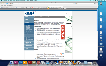
http://www.ukaop.org.uk/cgi-bin/go.pl/case/article.html?uid=458

Kerrang has a weekly circulation of around 70,000 and a readership of approximately 542,000. Their main aim in target audience is around 15-24, with a ratio of 60:40 male:female. Kerrang magazine most likely aims at the Grade E bracket, the low income bracket which contains students and that age group. The magazine is sold at around £2.20 although prices do vary from time to time. To attract this target audience a well known band is normally placed on the front cover, something new, fresh but something recognisable to the reader. Kerrang over the years has become more of a community as well as a magazine, this creates a very loyal reader, someone who will buy the magazine every week. To create more of a community they have to place something recognisable on the front cover. For example if they place a football on the front, it will appear totally of the subject and will not relate at all, It needs the representation and the iconic ‘Rock’ stars to carry the magazine.

With this research can now aim at the right target audience. I will be aiming at grade E and the ages 14-25, my magazine will contain various genres of music mainly around the rock/metal/pop class. The ratio of male to female is something i would have to research further to see who would buy this magazine, maybe talk to a few kerrang readers and ask them who would buy mine once i have the ideas decided. I shall have to consider the certain things i will have to do to attract both male and female audience if i compare my magazine to kerrang and go with the 60:40 ratio. Where as kerrang uses reputation to sell the magazine, this is something will not be able to achieve unless i can get some picture of a famous musician or artist. So i will have to find another way to make the magazine more appealing and to give it either the representation or USP.


Production log 15.01.09

January 15, 2009

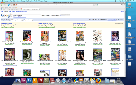
Today i researched into the existing media in the music magazine world. I have found out a lot about the different types and genres of music and thier magazines. I used google images to find the different types and to see what they look like.

Screen grab (magazine covers)

I studied the layouts and the way they look. The layouts appear to be very similar no matter what the genre, i also discovered that all the magazines used a red colour in the title, no matter what genre. For example XXL, Q, NME all use a red surrounding or lettering for the titles.

jan-xxl-covernme-mast07-final_blq_thumb

i also lookd into double page spreads and contents pages, studying the layout and the formal or informalness of the pictures and text.


Research into exisiting media.

January 15, 2009

After Seeing the main task brief, i started looking into music magazines of all genres to gain more of an idea of what my magazine would look like. I took into account the articles and the layouts of these pages. I have studied some particular magazines like, Q, Kerrang, XXL, Scratch  and many others. I have selected a few examples and written about them and there themes and their relation to my ideas.

https://i0.wp.com/www.electricsixlyrics.co.uk/images/merchandise/kerrang944.jpg

Early editions of kerrang

//www.biffierthanthou.com/photos/press/Kerrang%20Cover-thumb.jpg” cannot be displayed, because it contains errors.

Kerrang have a a noticeable mast head, it stays the same front in all of their front covers. Its become the icon/logo for the magazine, many people would see this and recognise the name and magazine. A colour theme operates though out the magazines, after looking at some other issues of the magazine you can clearly see that black white and red are the main colours. The layout normally consists of the mast head at the top of the page either in black or occasionally red. The primary image fills the whole page and normally has the front man/women appearing over the mast head. This implies that the band are alot more important than the name, the band and the image is more of a lure than the iconic name. A sub title of the bands name appears below the main image,  tags like  ‘free’ are used to make it seem like the audience are getting something extra fo thier money. Secondary images are placed in this example at the bottom of the page  or around the main image. The layout and general theme of the page create the impression of a rock/ metal magazine, this can be deduced from the connotations that the black and red colours have, black being dark mysterious and associated with heavy music. Much like red, but this can also and the connotations of blood and violence. When looking at the main image you can see from the long hair and facial hair, they don’t belong to a hip hop style genre. This then acts as the representation of the magazine, its represented as scruffy and slightly off the cuff.

//madnews.files.wordpress.com/2008/02/snoop_dogg_april_xxl.jpg” cannot be displayed, because it contains errors.

XXL is a magazine much like the first, the mast head appears in the top corner of the front cover. In this case much like the Kerrang magazine the artists head is over the top of the tittle. A sub tittle is again placed below and across the main image, it can seem that this tittle acts as the magazines main lure in the way of a title. The fonts are very clear and readable. Although this magazine has a very different audience to kerrang. They do have a very similar look, the tittles are very alike in fonts and also colour. (applies for some issues of kerrang). In costumes both seem to wearing very dark colours. The layout again is not to different, the primary image filling the page and then a banner headline below it. Compared to kerrang XXL seems alot less busy and clutter, there seems to be less happening on the page. In the way of representation the whole genre and the way the audience can recognise the magazine is once again from the image. A common theme occurs with the XXL front cover, the primary image normally consists of a black male, framed in medium to close-up. This can create the impression through our society and what we see on television and other media, that the magazine is of a Hip hop, R ‘N’ B, Rap genre. There for as the primary image can create representation, it represents the magazine as a R ‘n’ B music magazine, due to the fact that we associate the male in the Image as some one who would either like, listen or play this music. He becomes a stereotype of this genre of music. Iconic language is also used which can relate to this genre, words like ‘Pimp’ and ‘Hustler’ are iconic to this style and genre

https://i0.wp.com/www.nicksfix.com/q_magazine_cover_may2008.jpg

A common theme seems to be appearing with the music magazine world and the main colours used in titles and font colours. All magazines I’ve viewed seem to have a red coloured logo or name. It seems to be something which is common in the music magazine industry, i think it must be way for all the genres to tell the audience that its something to do with music. Its as though its become symbolic, a code convention, to show that it to do with music. The title and logo again are placed in the top left hand corner. The primary image mush like the others is placed slightly over the title. The sub title ‘Madonna’ acts as the magazine title, its font size is basically equivalent to the title, which really acts as a logo more than a title. Sell lines and teasers are placed all around the primary image, the image does a sense of crampedness, i personally feel thy went to far with the teasers. The main image has a very clear representation of the magazine, you can see from the way the female is dressed that she is very mainstream. At a guess i think any one would say she’s in the ‘pop’ genre. The blonde hair and her face concealed is a brave move or picture to use, it shows that she has to be well known so people will recognise her. There is only one secondary image this implies that the main image and story must be strong enough to sell it. The lower half of the Page uses a tag to lure the viewer/reader, by advertising ‘Free inside! 70-page speacial’.

Contents Page

https://i0.wp.com/www.geocities.jp/mcr_lock_and_load/ABOUT_MCR/MAGAZINE/k1044_c.gif

The contents is much like a front cover in the way of its layout, A primary image is placed to one side and information is placed around it. The image used is alot different from the front covers, in this example the image is not set up its a live shot of and artist playing. The picture appears alot less formal and less direct. As though the front cover needs to keep eye contact with the buyer, to interest them and involve them in the magazine, where as the contents page doesn’t it already the readers interest so i can be less formal. The layout for the contents is placed in a column style, its much like as list split into sections. Images are placed at the top to add to the stories, they have numbers and titles with them so you can link then straight to a page. At the very top the word ‘Contents’ is placed to act as a mast head of the page, its not meant to stand out as much as a mast head on a front cover, its just there to tell the reader what the page is. Next to this the issue number and date are placed, this is something i forgot to add on my contents in the first task, so i shall remember it for the this one. At the very top left hand corner there is an editors note, just a little comment from the editor in this particular issue and anything that took place. In term of the lay out its very simple and kept to the basic minimum.

Double Page Spread
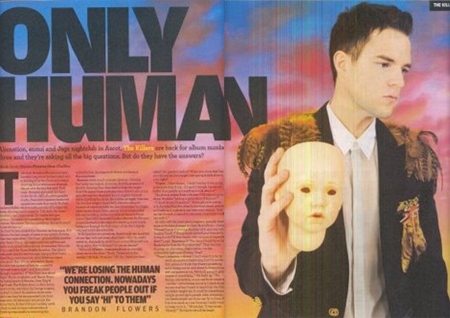
untitled-1

I can see straight away from the layout it is only a one page article and a full page picture, obviously because the article and image are not on the same page the article can be alot longer. The back ground from the picture caries onto the article page, At first glance i do feel that everything has been slightly over sized to fill space. When you look at it to read you don’t notice but looking at it and analysing it you can see that the title is far to big, it takes up nearly half the first page. Also the quote featured in between all the articles, i personally feel this is not exactly needed, its probably  in the article some where already. I can see that for my double page spread the picture will be very important, its Page filled already, i am Farley confident in this because of my photography skills and my experience with a camera i feel i can achieve a decent picture to place on there. In the way of layout and colours i can see where i will need to include certain things, a colour theme i feel is very important. It helps the viewer know that the article continues onto the next page, that the pages are related. Representation in this case are very clear, the picture creates the emotion that the music is very different and creative, its something slightly different from what we know. A strong statement is being made with a babies head, I’m not to sure on the whole head part but that baby could represent birth, or rebirth. The subject is looking away from the camera, using the skill of indirect eye contact, this creates a very emotional look in the models face. the picture may reflect the article, its something i shall have to look into further.


Are the attractions of going to the cinema today sufficiently strong to compete other ways in which we can now watch films?

January 14, 2009

Are the attractions of going to the cinema today sufficiently strong to compete other ways in which we can now watch films?


After studying the resource material, an argument appears for both sides, highlighting some good and some bad reasons. In today’s world technology is a key part to its success, the more advanced the better the picture the more we enjoy. Comfort is a very good reason to get the DVD and stay home and watch it. I shall be discussing these reasons and a few more in my answer.

            In the press release, ‘Vue buy Warner village cinema chain.’ Technology is a high factor in their aim for success. I feel that the constant increase in technology and the fast advancing age of cameras and cinema screens is a very strong attraction to go to the cinema.

“We will continue to expand… Cinema circuit in the UK.”

The vue brand will continue to advance to give the audience the best cinematic experience. The dark knight, a 2008 release broke the records for the largest amount taken in its first week end Gross, it took $158.4 million, in the first week end. From my personal view I think this alone is clear enough evidence to show that attractions are still strong in the cinema world. On the technology side, The Dark Knight also had very strong attractions to make people visit the many theatres across the world. The dark knight was the first film to be shot using IMAXR cameras. Warner productions, not only published a press realise detailing the future Advances in the cinematic world. They now have the film to prove that technology is one of the large attractions to going to the cinema. The experience of the latest IMAXR cameras can not be experienced at home, to gain the full Verisimilitude of a movie you have to be sat in front of a mega Screen, watching a film filmed with the latest technology and shown on more. Warner published a press release saying how they want to create the best possible cinematic experience in 2003. 5 Years later, with this advanced technology they spoke of we can now see how this is and will become a bigger attraction for going to the cinema.

            In today’s film industry, the institution and distributor rely on the DVD sales as well as the cinema gross. I think this is not a downfall of the cinematic experience. A DVD is another way of viewing a movie, but in many cases you have to wait a long time after the film has been shown in the cinema. In relation to my case study the Evidence shows that if a film sells with in the cinema, DVD gross sales will reflect that. I think DVD’s the main other way of viewing a film is not taking away the cinematic experience, it just brings in the added gross. As mentioned by Paul Hamilos, a DVD allows you to watch a film in the comfort of your own home, where you can drink, smoke and answer a mobile at any time. Although this may seem a lot more free and enjoyable, the majority of the time you will have to wait a few months before you get the chance to see the film. Cinema is the first way to view a film, if that film is good the DVD sales will be the same. This is most of the time due to viral media (word of mouth), it creates a buzz through the internet and friends any many who saw the film will buy the DVD, some who didn’t will as well. DVD may be a enjoyable way of viewing a film, but by far the attractions, mainly of seeing it a lot earlier are very string in keeping Cinema alive.


Evaluation

January 8, 2009

My coursework out line was to create a college magazine front cover and contents page using photoshop and other image manipulation programs. I chose to go for the print option, the front cover had to feature a medium close up of a student and other generic conventions of a magazine. My first reaction was to research the style and layout my target audience would want. I looked a few magazines some mostly just any to get and idea of how they and what’s needed. Once I had decided what magazine I wanted to do look further into that audience. My idea was to create a magazine purely for photography students, helping them with advice on cameras, equipment, college and university courses and much more. The main aspect and the unique selling point was to feature other students word from all different colleges around the country. After deciding this I looked at a lot more photography and art based magazines to gain a good understanding of what that audience would be looking for and used to. I came to the conclusion that the less on the front cover the more appealing it became, I personally also like this style so i decide to make sure this was reflected in my plans and final piece. I started of with just a few sketches and and some lay out plans to get a basic idea for my front cover. I also sketched the idea and design I had for the front cover picture. the lay out was something I thought was very important, I first thought about the magazines we see everyday and the slightly hectic look the front covers have, I thought this would be the sort of thing to follow, but after my research I realized that this is not what my audience wanted. In the construction stage it took me a while to get to grips with photoshop, now I’m fairly confident with it and feel I can achieve a lot using it. I started off using a basic photograph I had, the one I was originally going to use on the front cover. After some decision and using a questionnaire I decided that the image i used was maybe not exactly the right photograph. The comments I received highlighted the fact that the image did not really show a student. My original sketch was to have a model holding a camera taking a picture, so this would look a lot more like a student. I made a few adjustments to the front cover and ended up with the piece I have now. In photoshop I first edited my image, it was a simple picture much like what I sketched in the first stages, I did some basic editing first, changing the levels and curves to gain the most out of the image. After the main adjustments I went to image, adjustments, and then black and white. I used this because I feel it gives it creates the nicest black and white image. My draft front cover was used as an outline for my final front cover. I decided on bold lines and simple fonts and the minimal amount of information on the front cover because this is what I found my audience preferred. I started with just a plain layer, I then added a gradient to create the background, I did plan on having the photograph fit the whole page but as it was a landscape image I decided to place it in the top half of the page. I then continued to add the Mast head, tag lines etc… I didn’t use any buzz words as I feel they clutter the page. I used some plugs to intrigue people to buy the magazine. I made sure the photograph I used was a medium close up, to relate to my brief. Up until this point I felt very confident in what I had done. The challenge came when I got a bit experimental with all my work, I started using some gradients and different font overlays and outer lines to create different effect, this really helped me gain a better understanding and become more advanced with photoshop. After applying the basics I added a few adjustments, like for example a bar code because this is one of the most common things on the front cover of a magazine. A slogan was also featured to keep the common aspects of the magazine. I think I did very well in creating my front cover and have kept to the brief, I have designed it around my target audience. The contents page was kept to the same theme which was very minimal, I like the look of the contents page it has a nice elegance to it. Applying the image to the top of the contents page was the biggest challenge I had, I had to get the exact measurements to make it fit perfectly with out looking warped. I discovered through time and patience that photoshop had a ruler tool. This taught me that with enough patience you will find what you need. I really like the way this looks it does look a lot better than just adjusting the size using free transform. The whole theme of my front cover and contents page is to keep it all in black and white, I like this idea mainly because if I saw it on a self it would appeal to me, seen as not many other front covers would be in black and white. It was something I stumbled across, its only really happened because the original image I used for my draft was in black and white. I’m glad I decided to do this because it really makes the whole cover.

With my final piece, I had a tough decision between two examples of my front cover. When making the decision I was taking into account the brief and how well it relates back to it, also which had the nicer look and the USP of my style and Genre of magazine. Of the two designs both ticked some boxes, I much rather preferred the design of the first draft I produced, it had that certain elegance to it and the verisimilitude of a front cover. The other my recent design contain every the other did, apart from the main image. I decided to go with the second because through my focus group and replies I got from that I realised that the main image didn’t relate to my brief of having an student featured in the picture. The new image contained a student holding a camera taking a picture, this relates to the brief and also the how context on the magazine. When making this second draft I had not originally decided to have the small Polaroid placed on the cover, there was nothing filling this space. After discussions with friends and asking a few questions I realised that it looks very bland and boring with nothing there, I was going to just have the picture with a white frame and not the Polaroid style frame because I thought this would be too cliché and very common. I experimented and tested to see how it all looked and when trying out the Polaroid frame I realised it suited the whole essence of the cover, it added more white to the page balancing out the black. I made this decision because I felt it was better for the USP of the magazine, but still kept to my plan of the clean style front cover, it was also something my research had helped to decide. My previous drafts, I felt didn’t stand up to what I needed from the brief. After taking careful consideration into my focus group and taking in the comments I had received. I made decisions in creating iconic signs placed on the front cover to gain the audiences interest and attention. It can also create meaning as it will be easier for them to connect to the person featured on the front cover, as they are a student. To attract and address my audience I used iconology which creates the effect of placing a genre over my magazine, the name for example ‘Aperture’ is a term strongly related to photography, the camera also works in the same way. The magazine creates he representation of a young magazine, alternately this could be a downfall for the magazine. Placing a Student on the front cover may put off the older audience. Obviously as this will be published and sold in a college, there wont be much of a market for the older audience. When talking about narrative I feel that the cover can tell a very strong story, relating to an article featured in the magazine. The picture features a student but a student taking a picture, the shot shows action and someone getting out there and actually doing it. It creates an inspiration for the audience, they see some one doing it, so they want to as well. I have learnt a lot about the industry through my research, for example where it would be published places best to sell it. The institution that will have to publish the magazine, I feel this is something I have failed to mention in making a realistic front cover and contents, I have not discussed it at all neither have I placed logo’s or company publishing names on the pages. This is something I shall remember for my preliminary task.

In comparison with other media products there is a clear style that emerges. A very neat, uncluttered front page much like Digital SLR magazine, after researching and seeing this magazine style I realised this was the style and some what stereotype these magazines had. My Front cover and contents address the audience in a very similar way, they are both very inviting and keep everything to a minimum. The mast heads appear at the top, not to overwhelming and a medium size. I personally think if a mast head is to large it becomes very cramped and also intimidating, the mast head is the right size, well seen, eye catching and enticing. Both use a very simple and readable type face. A few lines of writing bellow the mast head and some above. In comparison the DSLR magazine does have a lot more on it, there are a few things that I have failed to include in my font cover, a competition for example its a good way to lure a reader. I think my product fits in with the whole stereotype and iconic look of a photography magazine, the photograph is the main concentration on the page, its not only the primary image its the primary lure. I personally feel from a buyers point of if the picture isn’t good, I won’t buy the magazine. People generally view magazines just as much as they read them, so they will go by what they see. I think that my magazine would fit into the audiences expectations, bearing in mind that its a totally different institution and market. I’m aiming to appeal to students, where as DSLR has to aim to adults and younger, I think its target audience would be around 13- 40, male and female. Mine has a target audience of mostly 14-23 depending on its distribution and publishing areas. On comments from my focus group from my peers, a mixed group of people some interested in the subject some with no interest at all. After seeing responses I am fairly confident that this would be received well by my target audience. The symbolic codes are part of the reason I feel it was as successful as it was, I found using a student was a great way of addressing the audience, they gather from first viewings that this magazine would be aimed at a younger audience. The use of an attractive young female is another way that might have attract them to the front cover and contents page. I decided to use a female instead of a male because after some consideration I feel that the male audience are more likely to view the magazine first then read, where as female I feel are more into the article side then the photographs. The use of complete black and white was received well by my focus group, its was found to be more eye catching due to its difference. I added the Polaroid to add to the visual appeal of the front cover, after seeing the DSLR front cover I realised that this was something that most magazines did, I decided to use the Polaroid frame, so I could use the bottom part to place so text on, a tag line, detail what’s is the magazine.