Production Log 26.02.09 (first draft)
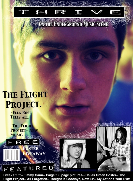
February 26, 2009In todays lesson i created the first a first draft for my Front cover. During the process of creating it i was constantly looking at a kerrang magazine for reference to what i need to include. The kerrang mag is the basis and the same target audience as my magazine, so the style and design if similar will attract the same audience. I first started with a plain image, which i have taken and edited myself. The picture is of a male in a medium to close up, this is not anything like what i wish my final front cover image to look like.
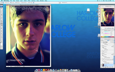
The the image i have planned for my front cover is more of a medium shot and less of a close up. The picture i used is more of just a background i don’t plan on using this in my front cover. Although i really like this image i don’t think it fits with my style and what the audience would be looking for. I really like this picture, the lighting looks good and its very engaging to the reader, the direct eye contact locks the viewers eye line with the picture.
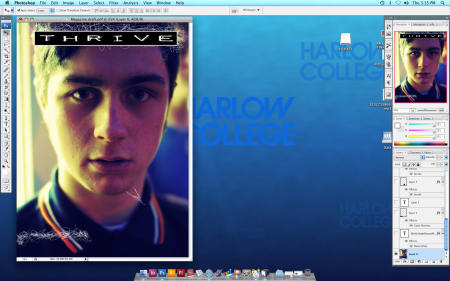
After processing the size of the picture and changing it to A4 paper size. I then proceeded to look for a suitable font on the internet, after searching a few different sites i found some i like and felt that they would be the right design and shape for this style. I tried a tested all the fonts in the draft to see which i preferred, i ended up settling with the one featured in the screen grab above. I have saved all the other fonts for later reference when making the final cover. The reason i choose this font is because it was good at standing out, but yet not to large or impeding. The font is inside a board which helps break it away for the background, making it stand out a lot more.
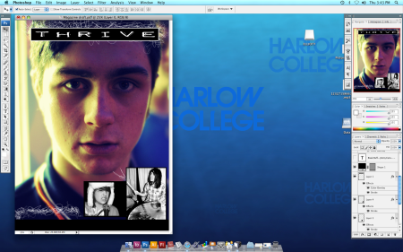
After the title i added the bottom border which will i planned to later cover with tag lines and teasers. This i gained from looking at the kerrang magazine, details of what was featured inside the magazine was placed in this section of the page on their magazine. I aimed to keep the design alike but learned from my research most magazines are laid out in a similar fashion. NME for example is basically the same but appears less clutter and hectic than kerrang. My design is a mixture between the 2, not as clutter but with some hectic parts to it. I then added some secondary images again these are pictures that i am not planning on featuring in the final cover but the layout is more important in their case. The size i think is perfect in comparison with the image i have used, With my main image for the final cover being more of a medium shot i think the secondary images can afford to be a bit bigger. This is something i shall experiment with when making the cover.
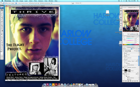
Next i placed a ‘featured’ title above my tag lines and cell lines to draw attention to this area. Its in the same font as the title so it recognizable and follows with the theme and style of the cover. I placed the title at a slight angle to make it appear more of the cuff, and messy. I like the slanted look it makes it a little bit different and brings your attention more towards it. The title placed in the middle of the page is the main feature and the title for the person feature in the picture. Much like kerrang, they place a second title normally more visible and readable than the main title at the top of the page. It works at the selling point for the magazine in their case, that particular band are the main feature and then the audience know that there will be a 3-4 page article on this band. With the picture being a close up i couldn’t place the title across the image to make the page more symmetrical. I used a different font to let the audience know that its now to do with something else, Its now the band I’m mentioning not something to do with the magazine ‘brand’.
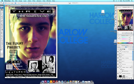
I added my few touches to complete the magazine, as it is a draft i shall look over and check if there is anything i have missed or can change. It will be shown to my peers and my focus group to gain more of an idea of where i am and what peoples responses are to it. The last few things i added was insight sentences below the band title in the same font to keep with the theme of anything to do with the music being it that font. The sentences used were just to add more detail into what is featured and the articles that are inside the magazine, I added a slogan below the mast head and a Buzz word to give the reader more incentive to buy. the word ‘Free’ was shown so people know that they are going to get something extra when they buy the magazine. A bar code to add to the authenticity of the magazine and a price to make it look more like something you would see in a shop.
magazine-draft
This is the pdf of my magazine front cover first draft.
Production log 12.02.09
February 12, 2009In todays lesson we spent most of the time planning for our presentation of our preliminary task. In the rest of the lesson i took a look into different types of fonts and drafts for my front cover. I am still waiting to get my pictures taken and sorted for my front cover contents and double page spread. The lesson was good i gained a good idea and start of my basic design. I used a few practice fonts and tried out some different styles. The image and the main part of the draft was very basic, just a picture i had taken out side college. The fonts helped me gain a good understanding for size text and colour, i learnt what goes well with what and what, in the ways of colour and size. Positioning was another thing that i experimented with trying different places on the page. i had a good understanding of what the image is so i had a good idea of where i wanted it but i still tried some different ideas.
draft-practice-fonts-copy


 Posted by Elliott


