Representation of tv Drama

April 30, 2009

Representation in teen drama’s

Skins

http://www.youtube.com/watch?v=Ho69_sCkwyI

Age is represented well in the Skins clip by the use of cross cutting between the adults in the pub and then the teenagers walking in. the camera shows what seems to be a normal average pub with young adults around their 30’s and 40’s. The camera then cross cuts to seeing the teens walking in laughing, this showing that they are kids and they are out out to have fun. The camera then cuts back to the adults with what looks like scornful looks glaring back towards the teenagers. The representation of the Adults contrasts completely with the teen agers. The teenagers are first shown to be laughing and enjoying themselves, full of confidence. Then to contrast, shown parallel to this are Adults playing pool and looking very envious of the kids and the way they act. Age is represented to be free and enjoyable in this clip, this may not be the case but this programme has decided to shown people in their teens this way. As the clip progresses We see that the representation soon changes to show them as violent and destructive. One shot that is shown frequently is the adults shot from a lower angle with the teenagers below, this creates the feel that the adults are looking down on them and as though they feel they are better then them. Another thing that’s sits in contrast with this is the music and Non- diagetic music played over the top, the music creates a very retro feel to the scene. Its more like 70’s 80’s music, this might be an atempt and showing the representations of teenagers and their tastes, the fact that we feel like we seem to be inventing everything, when really its all been done.

Sexuality Isn’t represented clearly in this clip, the costume of all the characters looks young and ‘in’. None of the characters are dressed as though they want to appear gay. One of the first shots shows the character Effy with her arm around a male, this creates the impression straight away of a close relationship as friends or partners. Freddies character is shown with a female in the toilets. This creates the representation that he straight and sexually confident with this. The location makes the characters representation look trashy and very ‘Sleazy’. The appearance of the males and females are very obvious and fairly cliché but not for this age group, You expect to see this behavior shown in older characters. The males are shown as sexually confident and very bold, cocky and arrogant. The mise en scene used when Cook lights a flare shows the lighting and colour theme as red, this can represent the character and the group as well. It shows then as passionate and violent, red has a strong connotation of violence and blood. His stance also adds to the representation of the character being cocky, he is standing on a table over people as though he feels he is on another level and better than the others. Females from the very first shot are shown as easy by the way we see Effy slumped over JJ.

Ethnicity

The Representation of the characters in terms of Ethnicity are very minimal, the majority of the characters are shown as English and slightly cockney at that. There’s one boy in the group who is from African decent and has a very strong accident. Also Freddy’s mother in the series was from Indian decent which is clear in the story. There is a diverse set of characters in the show, but in my clip none of the Ethnic representations are highlighted. One thing i did pick up on was a shot of a dark skinned male glancing over towards the group of kids, then a shot joint on after of the Character tomas who also looks as though he was from African decent. I’m not to sure whats meant to be shown or represented by this series of editing, but obviously with most media texts it is polysemic and can be read differently by different audiences. But my in opinion i see this as an attempt to create more of a racial contrast in the programme and so that we don’t focus on the

Class and Status

The class and status are shown clearly by the use of camera angels and framing. As the group of teenagers enter the pub we see a series of jump shots cutting between the group and the people in the pub. we always see the older group on in the pub looking down on and giving scornful looks towards the teenagers. the use of Low camera angles when showing the adults creates the impression of a class divide and that they are better then the teenagers. Camera angles play a key part in the representation of class and status the acting also acts key in this, the scornful looks as though they are disgraced shows a divide between the two cultures, divided by age. the editing helps create this Opinion by the way we see happy laughing kids then stern looks on on adults, the quick cuts between the 2 makes you think they have done something wrong.

Physical Appearance

Costume, hair, props.

The costume is very typical for the teenagers they are wearing hoodies with hoods up, this again creates a bad representation by what we are feed by the news papers and media. hairs long one some characters and the female are well made up with makeup. Each characters costume is designed around the character them selves. Freddy for example has the dark skin ‘topman’ cliche look to him, the long hair fringe style. this creates the ladies man impression which fits with the part were we see his with a female in the bath room making out. All the main characters are good looking and healthy, this is done to make the audience idolise the characters for looks, making people want to be or be like these characters.

Regional Identity

None represented

Disability

None shown in clip


Representation

Age
Sexuality
Ethnicity
Class and status
Physical Appearence
Regional Identity
Disability

in detail:

Camera Shots, Angle, Movement and Composition
• Shots: establishing shot,
master shot,
close-up,
mid-shot,
long shot,
wide shot,
two-shot,
aerial shot,
point of view shot,
over the shoulder shot, and variations of these.
• Angle: high angle,
low angle,
canted/dutch angle.
• Movement: pan,
tilt,
track,
dolly,
crane,
steadicam,
hand-held,
zoom,
reverse zoom.
• Composition:
framing,
rule of thirds,
depth of field –
deep and shallow focus,
focus pulls.

Editing
Includes transition of image and sound – continuity and non-continuity systems.
• Cutting: shot/reverse shot,
eyeline match,
graphic match,
action match,
jump cut,
crosscutting,
parallel editing,
cutaway;
insert.
• Other transitions,
dissolve,
fade-in,
fade-out,
wipe,
superimposition,
long take,
short take,
slow motion,
ellipsis and expansion of time,
post-production,
visual effects.

Sound
• Diegetic and non-diegetic sound; synchronous/asynchronous sound;
sound effects;
sound motif,
sound bridge,
dialogue,
voiceover,
mode of address/direct address,
sound mixing,
sound perspective.
• Soundtrack: score,
incidental music,
themes and stings,
ambient sound.

Mise-en-Scène
• Production design:
location,
studio,
set design,
costume and make-up,
properties.
• Lighting;
colour design.


Focus Group

April 23, 2009

First draft.

magazine-draft

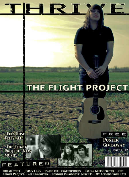
This was the very first attempt at my magazine front cover, all images are original and writes about this front cover are featured on my blog. When presented to my peers and people in my focus group the comments weren’t particularly supporting. The images and colours were described as very ‘In your face’ I did lower the saturation of the image and then see if this was to make a difference but the offer aspect that made it in your face still stood out. The subject has a very direct mode of address and keeps dead eye contact, this was seen as intimidating and took peoples attention away from the magazine itself. Comments on the layout and font were mainly that it was along the same styles as Kerrang, this was something i didn’t want. The sketchy lines around the mast head and text sections suit the style but the style is not exactly what i am aiming for. Fonts were commented on as to be to same-ish and repeated. I do like the fonts for the bottom half, the fonts for the words ‘Free’ and ‘featured’ although i do not like the mast head font. All in all looking at this front cover i can’t see the design that fits my magazine.

Second Draft.

magazine-draft-2

The main comments made on my first were that it was to loud, that the primary image was to distracting and didn’t fit the whole meaning and personality i wanted to create for my magazine. this primary image was more along the lines with the picture was planning to use. The comments i received with this draft were the total opposite to the last, this one seemed to be to bland and boring, it had the same effect but for the opposite reason. Speaking to a potential audience, i took into account what they had said and realised that i need to create something that balances between these 2 drafts. In terms of fonts, this was turning out to be the most time consuming thing. The comments on this font, were again that it didn’t suit the style and ideology of my magazine. Other changed i made for this one was that with the Featured and Free text sections, i changed the White to transparent making the background take the place of the white. Nearly all of the comments were that it looked better in the first draft. One thing that i was advised to do was to use the same model, i had already planned on using the same subject for my pictures. We agreed that the subject gave the exact personality and representation the magazine needed and would be a good look for the magazines front cover.

Final Draft.

nearly-finshed-front-cover1

This draft received very good feed back from my focus group. It was said that the right representation is created for my magazine with this front cover, it contains the right elements to make the perception that i want people to see. The mast head font was received well, although it has a strong similarity to Kerrang my audience found that it had the right shape for the style of magazine. I personally don’t think it work, I’m not keen on the similarities to Kerrang and i don’t think it suits the rest of the design. I had to make the decision to settle with this font because i had spent so much time already looking at fonts, the one thing i will not try is designing my own. This may take twice as long to achieve but i feel i have more freedom in doing this. Seen as we were so close to the deadline i decided to leave it as it is. The image was highly rated by my focus group, it was said to look very professional and a lot like something they would expect to see in a music magazine. The layout was also something that got a good response, the lines that separated the top and bottom and the mast head were said to make it look a lot neater. I’m pleased with the overall outcome of the front cover, i know now seeing it after everything is finished there is a lot i would love to change, but i am happy with this result. I think my audience received my front cover well and were slightly intrigued about the general idea of the magazine.

Contents.

contents1

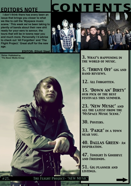
This was my only draft for the contents, after making it i was really pleased and didn’t wish to draft another. The comments i got from my focus group were good and i was totally happy with the results. The main things said were that it follows in the theme with the design and layout, the picture works really well and looks very good. There was a few comments saying that it looked to bland and i felt as though a few things were missing. I did take these into consideration and looked closer at my research to see if there were any common things that i had left out. There was some but nothing majorly important, the main one being competitions and sell lines. I personally think these things look tacky and wasteful, so i make the decision to leave them out. I want my magazine to focus more on the design and the pictures most of all the music not making it look tacky with promises of prises and give aways, these things are more for the front cover. Fonts and text were commented to fit well with the design, keeping it neat and clean.

Double Page Spread

dp-spread1

Again the same thing happened with my double page spread, i was so pleased with the outcome i didn’t see it was it necisary to create another draft. The comments again ewre all good and, the layout which i have carried on from the front cover was liked a lot and photograph was also something that was highly rated. This was my favourite part of the design process i loved working with the image and then creating the layout and design. Although i must admit the picture on my contents is my personal favourite, i sued my forst action that i had created on it. The one part then went down really well when discussing was the interlocking of his arm and the line through the middle of the page, i did this to add more to the design. I personaly think it makes it interlock more, as though he isn’t just a picture on a random page, you know he is part of the story. The text was something that was commented on and how it works with the name, I wasn’t to sure about the lined through the text at first but after taking it to my focus group and seeing that it went down well i decided to leave it.


Evaluation

April 22, 2009

Evaluation


For my project I choose to follow the prink brief, my task was to create a front cover of a music magazine, a contents page and then a double page spread. For the magazine I choose to work around the Myspace music scene, I closely follow this music scene and choose to work with this area of music because I felt it would challenge the conventions of other music magazines. Many music magazines on the shelves at the minute tend to more about the high status music ‘Pop’ scene. The specific genre is hard to specify, but the magazine is aimed to cover mostly the rock/pop, pop/punk styles. The magazine is based around a music area, not genre therefore giving me more of an area to work with. My main reason for why I thought this would be a challenging and successful market area was because many of the people into this area of music are big fans and follow closely, so even if there is a smaller market I think the majority of that market would be interested. In my mind raising the potential audience I can aim to. Obviously I followed out some research on particular magazines around that would be in competition with a magazine like mine.

My research started out with a broad look at music magazines, I looked at many from rock/metal genres to hip hop/rap. There was one clear thing I noticed with most music magazines and that was that most of the Mast heads and logo’s where mostly red. I personally think that red is associated with music magazines, this way it becomes an iconic colour, a symbol/ sign to represent a music magazine. In a way it’s a code to attract an audience even before they know what the magazine is specifically about. The reader will see the red and know that, this magazine will have something to do with music. I then looked deeper into the magazine media texts; looking closer and genres related more to mine. I looked at kerrang, NME, Q and a few others; I studied the layouts codes and conventions of the magazines. I also looked into the distributors and institutions of the magazines. The Bauer Media Group and the publisher for Kerrnag and Q and the NME are published by a major company called ‘IPC Media’. I found this very interesting because I had long thought that Q and NME were published by the same institution. Know seeing that it isn’t I can now understand why these 2 magazines look very similar, both are in rivalry for the audience, but I do think that the audiences for the 2 magazines are slightly different. I carried out a few questionnaires to see which music magazine people read the most and to see if my music magazine would appeal to their interests. This questionnaire was useful and I did get some supporting comments but do have to admit I defiantly did not ask a substantial amount of people to gain results that are reliable. I had realised that in terms of my target audience it will be very close to Kerrangs target audience, obviously with a few differences. Although my magazine is challenging Kerrangs conventions by using bands that people will not know to introduce new music, I still think the audiences will be very close. When researching because of this I used information on kerrang to base my target audience around. I’m satisfied with this research and think it’s very realistic to who I would be aiming my magazine towards. I discovered that based around kerrangs audience readership, my audience would be in the Grade E bracket and of the ration 60:40 male: female. The average audience age will be around 14-24. Seen as my audience bracket is low the magazine will have to be cheap so students and younger people on a low wage will be able to afford it, I took this all into consideration when making the decision of what price my magazine should be.

            All of the previous things had encouraged me in the decision I would have to make when creating my media text. I’d like to think that my finished products have a good verisimilitude, and will appeal professional to the reader/ viewer. I personally feel that is definitely some of the best design work I have done and have taken a great deal from the creating process. I know understand how a magazine should look and the key things to create the right representation. As most media texts are polysemic, much like mine certain people will create there own representation they think it creates due to background, culture and lifestyle. But I would like to think that most people will take the representation I have aimed to create. The main thing I learnt was about layout and colour, and how these things can create the iconic representation of your magazine and make it recognisable straight away. When seeing these codes with colour and layout my natural instinct was to go against them, my view is that if all music magazines have similar layouts and logo designs and colours, how will you tell them apart? I really wanted to challenge these conventions and decided to not use red or follow the layouts that they use. I personally think to have a unique style is a great USP, especially when the music genre and area is something that goes against of the trends of the main stream music scene. The toughest decision I think I had to make through the whole process of creating my front cover was the choosing the front. The one thing I can say that I have definitely learnt is the importance of a font. Before doing this task I never realised how much influence a font has over the representation of the whole magazine, a font can change the way we see the main subject in the primary image and the whole perception of the magazine. As you can see from the first to drafts they are both different fonts, for the font on my font cover I’m still not pleased with it, I still don’t think its right just yet. I used a font for my double page spread which I think really works; it’s definitely a style I would have liked to have tried on my front cover. I found constructing the contents and dp spread fairly easy, I enjoyed designing these. The main reason I think this may have been was because I was thinking practically, I know as a reader myself the front cover needs to be good enough to attracter the reader, once you’ve done that the rest can be as simple or as hectic as you want, you already have the readers attention. One decision I had made even before the construction process was that I wanted it to look clean, I can’t stand hectic front covers, I personally feel that the primary image should be able to have the potential to sell the magazine alone.

            I am very pleased with my completed product, I think there is a good theme with the 3 parts and good continuity, so the readers would recognise the themes that follow throughout the magazine. I made many decision when making the media text and changed my mind on most of them, as you can see from the front cover and the previous drafts, they differ quite a lot. My product creates meaning for the audience by the representation of my primary image. I wanted to use a male because I personally think the females will be the hardest gender to attract. This wasn’t the only reason, I wanted the photograph to represent the music its self. I held a few focus groups to help me choose between the front cover drafts, the first I was told was to direct, the mode of address was very direct and represented the music and the audience I wanted to attract in the wrong way. It also had too many things going on, the style its self I didn’t personally fell worked; It didn’t fit the genre I was aiming at. The second draft was the same but at the other end of the scale, the colours appeared to boring and no one was excited or interested by the whole front page. When it came to the final draft I took these point into consideration and realised I had to find an equal balance between the two, I think I have achieved this. With my image I had planned it from the start I knew exactly what I wanted to achieve, I knew I had to make the music related but didn’t want to place an electric guitar in the picture. I felt that might look a little cliché and obscure, also I felt it might create the wrong representation. My plan with the primary image was to create a respectful and accurate representation of the social group that would read my magazine. I decided to use an acoustic guitar in the picture because I felt the sound of this instrument represents the social group I’m attracting. The soft, mellow relaxed attitude of this social group shows in the music scene they are into, speaking as a fan of this me and having friends of this area. I know that this particular social group don’t follow trends with music, it tends to be what they like and what they want. I think that this social group is full of individuals with there own ways of doing things but individually they find comfort with others. To me this is exactly the same as the acoustic guitar, alone it will sound amazing and stand out from anything with its sound, and together with a group of instruments it will work with them to sound good together. This was a long decision I had to make when planning the images, I thought this out thoroughly so when I constructed them I knew exactly what I wanted to achieve. With the layout of my magazine I had the decision to use a tag line, in my first draft I did use a tag line but as my designs changed I felt that the positioning would not suit the final drafts layout. I had tried many different places and in the end made the decision to leave it out. My subject was also my mode of addressing the audience; I wanted to use someone who they could relate to, someone they could familiarise with. The one thing aside from the pictures them self is the constructing; I’ve surprised my self in the amount I’ve learnt about Photoshop since I’ve started this task. For example the image featured on the contents page was edited using an action which I had created my self. Before I started this task I didn’t even know what an action was, let alone how to make my own. I can definitely say I’ve learnt a lot about the technologies I used to create my media text. The double page spread was something I can’t say I went against conventions with; most double page spreads have a very similar layout. I used a large image covering about one side of a4 which then continued onto the next. Where to place the text wasn’t really much of a decision mainly down to in depth planning. In comparison to my last project I defiantly fell that my planning has improved a lot and I can see how much better the results are when you do plan properly.

            I’ve learnt a great deal through the process of making this task, I haven’t just learnt about things I now understand a lot about institutions and how they work. I’ve learnt an unbelievable amount about Photoshop and how to create and do certain things. For example placing the subjects head in front of the mast head was something I wouldn’t even have thought about doing. But then after researching and seeing that this was nice look for layout and design, I decided to look into how to doing it. To compare my magazine to another in a way defeats the whole object of challenging conventions. I’ve tried to make my magazine look like a music magazine but with out using the particular conventions and codes all the other music magazines use. I guess the products that mine would be in close competition with would be ‘Rock Sound’ and ‘Kerrang’, I don’t see my magazine attracting and appealing to the same audiences as Q and NME. The only similarities are the Genres, In terms of layout I think mine varies a lot from Kerrang, rock sound doesn’t seem to have a theme, and the title is most of the time white but may change in certain issues. The front cover pictures are usually shot on a white screen and the font cover tends to be quite colourless. In terms of the institution I think Rock Sound LTD, the independent company would be the most likely publisher to accept my magazine, the main reason being that there are certain elements of the media text they publish which my magazine focuses on. So I think the 2 would link well in sales. Another way of looking at it is that they could publish my magazine as a small insert of ‘Freebie’ to the Rock sound Magazine. I don’t think mine would be accepted by the larger institutions such as IPC Media and the Bauer Media Group, mainly because I don’t that they would see much of a profit return to make it worth while. The one thing I’ve discovered with the Kerrang magazine is that it’s not only a magazine; it’s also a social group. There’s a lot more to kerrang than just a magazine, the social group side of Kerrang is the one thing that I think these magazines share in common; the social group I am aiming at is along the same line as kerrangs, there’s not much between the two. IPC Media are one of the largest magazine publishers in the UK; they cover all areas of magazines from fishing to women’s magazines. I think this institution would take on my magazine but I personally don’t think my magazine would benefit and be the same as what I had planned. Its seems to me that IPC tend to have very sameish magazines that don’t sell that well, but because they have lots that don’t sell and some that do they still get a good money return. I think my magazine would be received well by audiences due to the comments I got from my questionnaire and feed back I received in my focus group. I do personally think that this is not enough to make a sure guess, one mistake I made when doing the research was not seeing how the audiences would receive my magazine enough. Although I gained some good feed back, there’s no way this would be enough evidence. I think my magazine would be received well but with many things around in the media today it would have to be marketed right, focusing on the main key selling points and choose the right strategies to get my particular audience to see this marketing. The main way I think would be the best to make sure that my audience receive this marketing would be myspace. To create a profile and then try to get an advertising space on the font page, this would be the main way to make sure my audience receive my product. The way they receive it is also something I’m fairly confident with, being part of this audience I know its something that would defiantly interest me, seen as I’m not all the audience its hard to be completely sure, but I can use my knowledge to take a good guess. One main target audience which I have failed to mention is the bands and promoters, they will be desperate to get a page in the magazine and the promoters will be eager to see what new talent is being focused on in the week’s issue. These aren’t exactly primary audiences more secondary, but still a strong part that will make up my audience. These secondary parts of my audience I think would receive my magazine well, bands will be looking to get there music into this magazine and get some good publicity, Which could end up giving these bands a good kick start in their music career. Obviously I’m speaking optimistically everything has to work out such as marketing, creation and the right institution. On my magazine design I have placed ‘The Bauer Media Group’ in part of the contents page, this is not the institution I think would be involved with my magazine, I used this name because of layout and how it fitted my page.

            To conclude I think that my magazine looks good and will be received well by my target audience, I do admit that I had not done enough research to justify this but I feel being part of this audience it is something I would see as a good source of entertainment. I’ve learnt more that I could have imagined about Photoshop in these past few weeks, a gained a lot more confidence to be more experimental and challenge the way things work. I learnt from the preliminary task that I need to challenge conventions and do things my way and I think I have done this with this task. I have learnt a lot from the research and now can confidently say I understand the institutions and the way the media works a lot better. I think I have achieved in creating a representation that my audience will receive and relate to and familiarise with. I am pleased with my final drafts and the main thing I am most happy with is the photographs, I have keen interest in photography and I’m pleased with the results of my action I created and the pictures themselves, they fit exactly to my planning and work in the way I wanted them to.


Elliott Steel


3,032 words


Further Research: ‘Rock Sound’

April 21, 2009

I’ve only recently just discovered this magazine, i seemed to miss it when doing my early research and it’s something i wish i hadn’t. This magazine is a lot more related to my genre and magazine style, this magazine feeds on the music around at the minute to sell the magazine but then also places small amounts of new music for the readers. I personally think that if i was to ever take my magazine idea further, ‘Rock Sounds LTD’ would be the best institution to contact, mainly because i feel that the magazines share the most in common. Although the representation and genre of this magazine are slightly different i still think the aims of this magazine are better and closer to what i wish to achieve with my media text.


Representation

April 21, 2009

An audience will read the media and take in this information, in most cases they are being fed this media by someone who is also taking an opinion on what they are speaking of. This opion tends to be valued by the audience and may be swayed by what is being said. The audience will make their own opinion but it is normaly created from the person feeding the information. Some people belive that viewers are driven by these media texts, e.g films and games, ‘The effects theory’. The effects thoery is basicly saying that the viewers are ’empty vessels’ and we shall consume the media and follow be example, thie thoery was developed in the 1920’s and now many people think it is out of date. Representation theory, a more recent theory which i think is a lot more accurate. This theory basicly means the the audience will play a part in how they comsume and interpret particular media. Its more about letting each individual viewer think for them selves, witch out a viewer it would have no meaning.

Media texts are polysemic, they may be read differently by different people depending on background, culture, identity, opinions.

Age

Teenagers that are representation in todays media, like Skins for example in my opinion aren’t meant to be taken seriously, the representations aren’t very accurate. And i agree with Stewart Lee, theses representations won’t comfort or give any confidence to teen age audiences but in the long run these characters never have happy endings. We as an audience are meant to be shown these characters lifes, we aren’t meant to want to be them. It’s an insight into how some probably a small majority live. The characters may appear to being living happy and conetent with being teenagers, but this is the surface. The characters all have depressing background drama, family problems ect. I think it’s hard to say that the producers/creaters are trying to represent teenagers, in my opinion i think they’ve just created a drama which works in the same ways soaps ans dramas for adults, but aimed in at teenagers using younger people. They’ve tried to make it look exciting to sell it, but then placed in the drama to add to the entertainment value.

Gender

Male masculinity has changed over the years, the good example used on blackpool media is the comparison between James Bond and The Bourne trilogy. In the 60’s the bond characters was a perfect example of how the males meant to be, now this is seen as outdated. 60’s men were Authorotive, composed and smooth, now this is seen as a past time and the idea of a male has changed. Disney takes on a very old stereo typical look at males and females, the male is always seen as masucline and the saviour. Strength and dominance is always very common. Disney focus strongly on hetrosexual relation ships between a hero and a heroine, disney movies tend to create the images that women are only their to serve men, or for pleasure. For young males this image will effect the way they see things as they grow older, the representations in my opnion are to innocent to effect young children. I think that these things have only been noticed by adults because we are cabable of thinking of this. Children on the other hand are young and see this for entertainment, i don’t think many are cabable to take note of these representations. Females in the 1950’s were expected to be glamorus and devoted complelty to domestic work, these representations have changed over time and women began to start working, the career women had started. The present day women are completly controlled by the media, magazines being the main culpurate. With image manipulation at such high standards it’s imposible to tell what exaclty is real and fake. Women are now veiwed as equals and more socialy free.


 Male representation in the characters of ‘Bourne, Bond and disney males.’

The Bourne series creates a very common male representation, the mise en scene uses costume to make him look very average and normal, If this man was seen in real life you think twice about him being dangerous. The character has a good verisimilitude, where as compared to the Bond character it all seems very fictional and less believable. Jason Bourne in the very first shot is shown wearing a browny beige bland jacket. Where as compared to Bond his character doesn’t as real, the fighting seems unrealistic and the costume doesn’t fit with the cinema photography. Masculinity has a very strong appearance in the Bond character, he is shown wearing a dinner suit and fighting. These are 2 things that are very iconic with males, i think this is used to created the male representation.


Questionnaire- Summary of results

April 8, 2009

This questionnaire was passed around a short time after deciding my magazine outline.

I do not have direct results as some were misplaced, but  i gathered a lot of useful information from this and other research.

1) Please list your favourite music genres.

Top 5 were as follows-

  • Indie
  • Rock pop
  • Pop
  • Dance
  • R ‘n’ B

From this i can see that my choice of genres will appeal to more than what i had considered.

2) Please list which music magazines you read buy.

Top 3 were as follows-

  • Kerrang
  • NME
  • Vibe/ Maxim

3) What do you prefer to read about in these magazines?

-Information on the artist

-Gigs and shows

-Gossip

-The artist and their music

When seeing the results and talking to fellow peers i found that people tend to prefer to read about the artist and their music, background information on the artist was also well mentioned people want to know about the person they like listening to.

4)Average amount you spend?

-£1-3

-£3-5

Seen as my audience are mainly students and in the Grade E bracket i wasn’t shocked to find that people aren’t willing to pay more than £3

5)What freebies do you normally get and like getting?

-Posters

-Cd’s

-Badges

-Clothing

Posters was a very common response, although people had mentioned that they prefer to get clothing but it was very rare to get it.

6)Do the magazines you buy tend to your music tastes?

I was very surprised to see more people than i thought saying no, out of my response’s i think 41% didn’t think the magazines the read tended to the music they like the most.

7)In the way of layouts, which do you prefer?

-Clean and simple

-Busy and full

The result here was basically half, i discovered the the majority or females like to have a very busy front cover, where as males like something a little less full.

8)Do you listen to many of the bands and musicians on myspace and the Internet that aren’t main stream?

30% said yes and 10% said some so, really it’s a 40% market which i have to aim for. It’s not a massive market but as i said it’s a market that i don’t think is tended for, so most people in this market will buy.

9)Are you aware of a magazine devoted to this music scene?

Most said no, although a few said yes, i proceeded to ask them the name of the magazine, but they could not remember the name of it. I shall look into this again to check and see if i have missed a certain magazine.

10) Would a magazine based around the myspace music scene and the non-main stream music?

70% said yes, many commented that they’re intrigued to find new music and listen for different things. So this may be more or a potential audience. something i could try and do is draw new people onto this music area.

This questionnaire was carried out throughout Harlow college asking many different people.


Double Page Spread

April 8, 2009

dp-spread


Contents

April 8, 2009

Contents


Front cover

April 8, 2009

nearly-finshed-front-cover


Magazine ‘Personality’

April 2, 2009

nearly-finshed-front-cover

dp-spreadcontents

Here are my final Pieces for my front cover, contents and double page spread. As you can see from the 3 pictures, there is a following theme with the bold lines creating shape and a feel of organization in the media text. When reviewing and gaining comments on my media texts i was pleased with the response, most agreed that they could see the theme and how the pieces related to that same magazine. I compared my front cover to others that i had researched and had made some conscious decisions to make it different. When starting in the creating i mentioned that i wanted to against the conventions of the media text we see on the shelves in shops. This was just due to personality, i personally think much like a person a magazine can have a personality. this personality is created by the colors on the page, the domination of the image, the representation created by the Model/subject featured on the font cover, the boldness of texts and layouts. I think many magazines in today’s media lose their personality in the race to be the best selling, now obviously if i was trying to make money of this then my attitude might be different. For my particular magazine i don’t think this would apply, my magazine is all about the minor music scene, see my theory is there aren’t many magazines aimed at this audience. The main reason being it’s a niche audience, but i personally think being part of this audience that we are fond off and very into the music we listen to. Therefore making it a strong buying audience, a potential audience that is very passionate about the music they love and would love to read about it. I decided to go against the conventions of not having a busy front page, cluttered with ‘prize draws’ and massive fonts promising false prizes. I decided to do this because i don’t think this is needed to attract my audience, i feel word of mouth and the knowing that this magazine is what they would like to read is what will sell it.

For my magazine i think a very strong representation is created.When taking the pictures for the front cover and the other pages i took into consideration the effect that they would have on the audience and my magazine. The idea of keeping the sky as a background was create the colour theme for the magazine, a dark blue turquoise colour to represent a relaxed ‘no bull shit’ magazine. Unlike some others which feed into the crowd of ‘brands’ on the shelves selling you the same thing just with a different cover. The subject i used plays a key part is the personality of the magazine, i wanted the viewers/readers to relate to this person and see someone they might know. The subject is young and stylish, creating an idol or respect for some viewers. The only part of my magazine where my Ideology falls apart is the font. I spent a long time considering different fonts and asking peers and tutors opinions on plenty of different styles. Even now i must admit i still not pleased with what i have chosen but it seems to be the best i could get. The font i must admit is very similarto ‘Kerrangs’ which i think places it in the whole ‘Brand’ section of the media texts. It is definitely somthing  i shall consider changing now everything else is finished, i shall hold more focus groups and peer evaluations to decide.