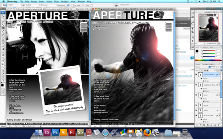
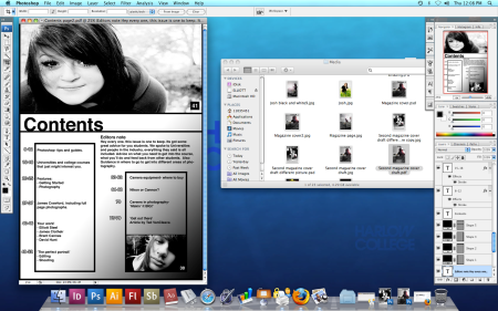
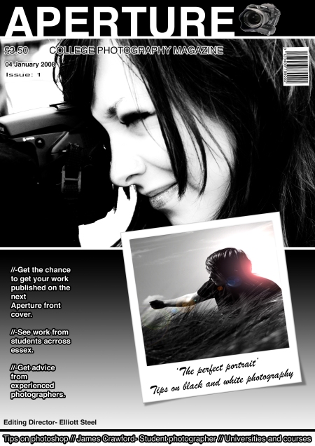
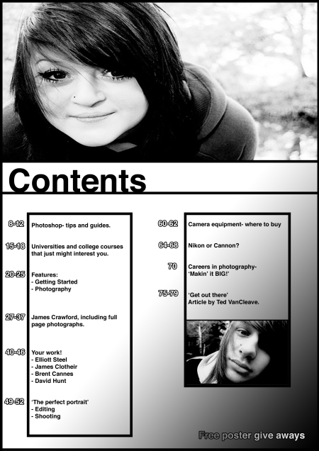
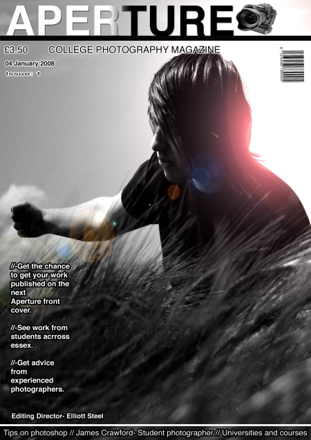
My coursework out line was to create a college magazine front cover and contents page using photoshop and other image manipulation programs. I chose to go for the print option, the front cover had to feature a medium close up of a student and other generic conventions of a magazine. My first reaction was to research the style and layout my target audience would want. I looked a few magazines some mostly just any to get and idea of how they and what’s needed. Once I had decided what magazine I wanted to do look further into that audience. My idea was to create a magazine purely for photography students, helping them with advice on cameras, equipment, college and university courses and much more. The main aspect and the unique selling point was to feature other students word from all different colleges around the country. After deciding this I looked at a lot more photography and art based magazines to gain a good understanding of what that audience would be looking for and used to. I came to the conclusion that the less on the front cover the more appealing it became, I personally also like this style so i decide to make sure this was reflected in my plans and final piece. I started of with just a few sketches and and some lay out plans to get a basic idea for my front cover. I also sketched the idea and design I had for the front cover picture. the lay out was something I thought was very important, I first thought about the magazines we see everyday and the slightly hectic look the front covers have, I thought this would be the sort of thing to follow, but after my research I realized that this is not what my audience wanted. In the construction stage it took me a while to get to grips with photoshop, now I’m fairly confident with it and feel I can achieve a lot using it. I started off using a basic photograph I had, the one I was originally going to use on the front cover. After some decision and using a questionnaire I decided that the image i used was maybe not exactly the right photograph. The comments I received highlighted the fact that the image did not really show a student. My original sketch was to have a model holding a camera taking a picture, so this would look a lot more like a student. I made a few adjustments to the front cover and ended up with the piece I have now. In photoshop I first edited my image, it was a simple picture much like what I sketched in the first stages, I did some basic editing first, changing the levels and curves to gain the most out of the image. After the main adjustments I went to image, adjustments, and then black and white. I used this because I feel it gives it creates the nicest black and white image. My draft front cover was used as an outline for my final front cover. I decided on bold lines and simple fonts and the minimal amount of information on the front cover because this is what I found my audience preferred. I started with just a plain layer, I then added a gradient to create the background, I did plan on having the photograph fit the whole page but as it was a landscape image I decided to place it in the top half of the page. I then continued to add the Mast head, tag lines etc… I didn’t use any buzz words as I feel they clutter the page. I used some plugs to intrigue people to buy the magazine. I made sure the photograph I used was a medium close up, to relate to my brief. Up until this point I felt very confident in what I had done. The challenge came when I got a bit experimental with all my work, I started using some gradients and different font overlays and outer lines to create different effect, this really helped me gain a better understanding and become more advanced with photoshop. After applying the basics I added a few adjustments, like for example a bar code because this is one of the most common things on the front cover of a magazine. A slogan was also featured to keep the common aspects of the magazine. I think I did very well in creating my front cover and have kept to the brief, I have designed it around my target audience. The contents page was kept to the same theme which was very minimal, I like the look of the contents page it has a nice elegance to it. Applying the image to the top of the contents page was the biggest challenge I had, I had to get the exact measurements to make it fit perfectly with out looking warped. I discovered through time and patience that photoshop had a ruler tool. This taught me that with enough patience you will find what you need. I really like the way this looks it does look a lot better than just adjusting the size using free transform. The whole theme of my front cover and contents page is to keep it all in black and white, I like this idea mainly because if I saw it on a self it would appeal to me, seen as not many other front covers would be in black and white. It was something I stumbled across, its only really happened because the original image I used for my draft was in black and white. I’m glad I decided to do this because it really makes the whole cover.
With my final piece, I had a tough decision between two examples of my front cover. When making the decision I was taking into account the brief and how well it relates back to it, also which had the nicer look and the USP of my style and Genre of magazine. Of the two designs both ticked some boxes, I much rather preferred the design of the first draft I produced, it had that certain elegance to it and the verisimilitude of a front cover. The other my recent design contain every the other did, apart from the main image. I decided to go with the second because through my focus group and replies I got from that I realised that the main image didn’t relate to my brief of having an student featured in the picture. The new image contained a student holding a camera taking a picture, this relates to the brief and also the how context on the magazine. When making this second draft I had not originally decided to have the small Polaroid placed on the cover, there was nothing filling this space. After discussions with friends and asking a few questions I realised that it looks very bland and boring with nothing there, I was going to just have the picture with a white frame and not the Polaroid style frame because I thought this would be too cliché and very common. I experimented and tested to see how it all looked and when trying out the Polaroid frame I realised it suited the whole essence of the cover, it added more white to the page balancing out the black. I made this decision because I felt it was better for the USP of the magazine, but still kept to my plan of the clean style front cover, it was also something my research had helped to decide. My previous drafts, I felt didn’t stand up to what I needed from the brief. After taking careful consideration into my focus group and taking in the comments I had received. I made decisions in creating iconic signs placed on the front cover to gain the audiences interest and attention. It can also create meaning as it will be easier for them to connect to the person featured on the front cover, as they are a student. To attract and address my audience I used iconology which creates the effect of placing a genre over my magazine, the name for example ‘Aperture’ is a term strongly related to photography, the camera also works in the same way. The magazine creates he representation of a young magazine, alternately this could be a downfall for the magazine. Placing a Student on the front cover may put off the older audience. Obviously as this will be published and sold in a college, there wont be much of a market for the older audience. When talking about narrative I feel that the cover can tell a very strong story, relating to an article featured in the magazine. The picture features a student but a student taking a picture, the shot shows action and someone getting out there and actually doing it. It creates an inspiration for the audience, they see some one doing it, so they want to as well. I have learnt a lot about the industry through my research, for example where it would be published places best to sell it. The institution that will have to publish the magazine, I feel this is something I have failed to mention in making a realistic front cover and contents, I have not discussed it at all neither have I placed logo’s or company publishing names on the pages. This is something I shall remember for my preliminary task.
In comparison with other media products there is a clear style that emerges. A very neat, uncluttered front page much like Digital SLR magazine, after researching and seeing this magazine style I realised this was the style and some what stereotype these magazines had. My Front cover and contents address the audience in a very similar way, they are both very inviting and keep everything to a minimum. The mast heads appear at the top, not to overwhelming and a medium size. I personally think if a mast head is to large it becomes very cramped and also intimidating, the mast head is the right size, well seen, eye catching and enticing. Both use a very simple and readable type face. A few lines of writing bellow the mast head and some above. In comparison the DSLR magazine does have a lot more on it, there are a few things that I have failed to include in my font cover, a competition for example its a good way to lure a reader. I think my product fits in with the whole stereotype and iconic look of a photography magazine, the photograph is the main concentration on the page, its not only the primary image its the primary lure. I personally feel from a buyers point of if the picture isn’t good, I won’t buy the magazine. People generally view magazines just as much as they read them, so they will go by what they see. I think that my magazine would fit into the audiences expectations, bearing in mind that its a totally different institution and market. I’m aiming to appeal to students, where as DSLR has to aim to adults and younger, I think its target audience would be around 13- 40, male and female. Mine has a target audience of mostly 14-23 depending on its distribution and publishing areas. On comments from my focus group from my peers, a mixed group of people some interested in the subject some with no interest at all. After seeing responses I am fairly confident that this would be received well by my target audience. The symbolic codes are part of the reason I feel it was as successful as it was, I found using a student was a great way of addressing the audience, they gather from first viewings that this magazine would be aimed at a younger audience. The use of an attractive young female is another way that might have attract them to the front cover and contents page. I decided to use a female instead of a male because after some consideration I feel that the male audience are more likely to view the magazine first then read, where as female I feel are more into the article side then the photographs. The use of complete black and white was received well by my focus group, its was found to be more eye catching due to its difference. I added the Polaroid to add to the visual appeal of the front cover, after seeing the DSLR front cover I realised that this was something that most magazines did, I decided to use the Polaroid frame, so I could use the bottom part to place so text on, a tag line, detail what’s is the magazine.


 Posted by Elliott